ShopDreamUp AI ArtDreamUp

Deviation Actions


Suggested Deviants


Suggested Collections


You Might Like…


Featured in Groups

Description
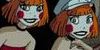
With the addition of The Hub to my available channels list, I've begun watching Batman Beyond again.
So of course, I had to redraw Dorothy.
She's undergone more costume changes and background revisions than any other OC I have, and I think she's remained one of the ones I've loved the most. (I can still vividly recall what her room looks like. It's cray.)
A lot of this information was already available on an old character sheet, but the design was outdated and it looked like crap all around. Plus, I needed to actually draw Toto. He's more fluffy now. (Don't let it fool you, he's hiding razor-sharp claws.)
Also, I made her taller.
And gave her hoverboard a kickass design.
...Which has nothing to do with its nickname. (She's like 14. She likes naming her shit to seem cool and edgy okay.)
Overall, I'm pretty satisfied. I think this is the first time I've actually really felt like I don't need to go back and redesign it later.
Bonus points(maybe even a free sketch request) to anyone who can figure out where in my gallery (or anywhere else, I guess?) they've seen the picture on Banshee before.
So of course, I had to redraw Dorothy.
She's undergone more costume changes and background revisions than any other OC I have, and I think she's remained one of the ones I've loved the most. (I can still vividly recall what her room looks like. It's cray.)
A lot of this information was already available on an old character sheet, but the design was outdated and it looked like crap all around. Plus, I needed to actually draw Toto. He's more fluffy now. (Don't let it fool you, he's hiding razor-sharp claws.)
Also, I made her taller.
And gave her hoverboard a kickass design.
...Which has nothing to do with its nickname. (She's like 14. She likes naming her shit to seem cool and edgy okay.)
Overall, I'm pretty satisfied. I think this is the first time I've actually really felt like I don't need to go back and redesign it later.
Bonus points
Image size
1120x950px 538.79 KB
Comments22
Join the community to add your comment. Already a deviant? Log In
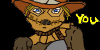
OC design is always tricky. When you make a character for an existing work of art, you need to find the balance between your own creativity and the feeling of the original work. It's a tough challenge, but a very educational one.
I feel that with this OC design, you've hit the balance pretty well!
The color scheme is what stands out the most, and I think for good reason. You've gone for a red/black combo, something fairly overused these days, but you made it work well. You put it to different use, and with the white, it feels more bright and vibrant. You can easily put this scheme next Beyond's Batman and still see a lot of difference. You went for less black and more white and red, which I like.
The design itself also appeals. The character makes sense to me and she looks like a character I can picture on the show. My only complaint is that I feel she's kinda young - Teen villains are always tough to pull off, especially when you want to make them more than just a thug or gang leader. Since I don't know more about your character, I can't judge how well you pull that part of, but it's just something I wanted to mention.
The parts I like the most are the clothing. Her villain outfit works because it combines modern style with oldschool elements. I think I would make the hat a bit less big, but that's all. It's an outfit with a distinct silhouette and good ideas.
Overall, I think this looks like a fitting design for a Batman Beyond character. Keep it up!